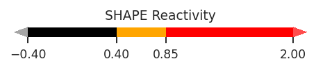
Visualizing data
With your data loaded using an RNAvigate Sample object, you can start creating visualizations and analyses. This document will show you what types of plots can be created and where to find more information.
Contents:
[1]:
import rnavigate as rnav
from rnavigate.examples import tpp, rnasep_1, rnasep_2, rnasep_3
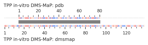
Alignment plots
Alignment plots visualize how two sets data will be positionally aligned in RNAvigate plots. It is a good idea to check the automatic alignment if two sequences differ significantly. For the most part, this is not necessary for deletion or point mutants or subsequences.
[2]:
plot = rnav.plot_alignment(
    data1=(tpp, "dmsmap"),
    data2=(tpp, "pdb"),
    )
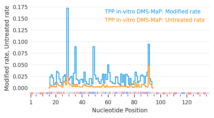
Skyline plots
Skyline plots flexibly display and compare per-nucleotide data sets.
[3]:
plot = rnav.plot_skyline(
    samples=[tpp],
    profile="dmsmap",
    columns=["Modified_rate", "Untreated_rate"])
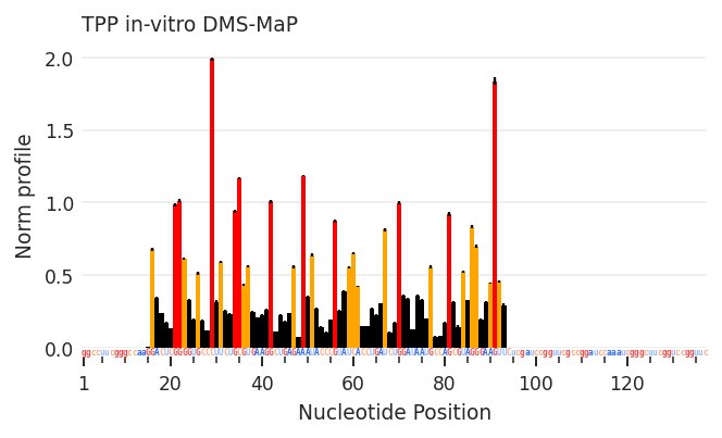
Profile plots
Profile plots display per-nucleotide data as colored bar graphs similar to ShapeMapper style bar graphs, but very flexible.
[4]:
plot = rnav.plot_profile(
    samples=[tpp],
    profile="dmsmap",
    )
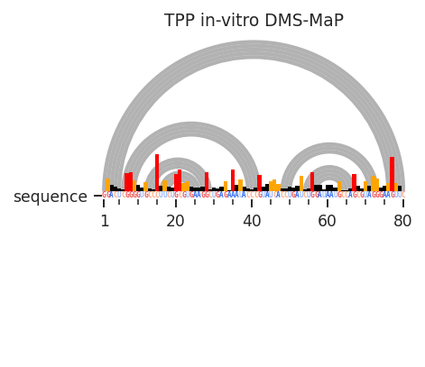
Arc plots
Arc plots flexibly display inter-nucleotide relationships and secondary structures as arcs. Per-nucleotide measurements and sequence annotations can also be displayed without over-crowding.
[5]:
plot = rnav.plot_arcs(
    samples=[tpp],
    sequence="pdb",
    structure="ss",
    profile="dmsmap",
    profile_scale_factor=5,
    )
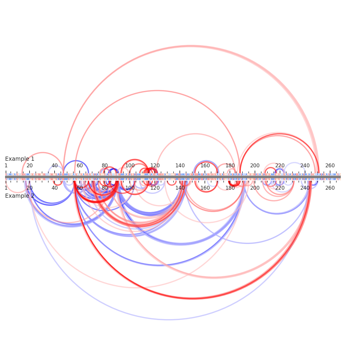
Arc compare plots
Arc compare plots are the same as arc plots above, but compare two samples on the same axes.
[6]:
plot = rnav.plot_arcs_compare(
    samples=[rnasep_1, rnasep_2],
    sequence="pdb",
    interactions="ringmap",
)
Circle plots
Circle plots are similar to arc plots, but display nucleotides in a circle so that any size RNA fits in a square area.
[7]:
plot = rnav.plot_circle(
    samples=[tpp],
    sequence="pdb",
    structure="ss",
    profile="dmsmap",
    colors={"sequence": "contrast",
            "nucleotides": "profile"},
    )
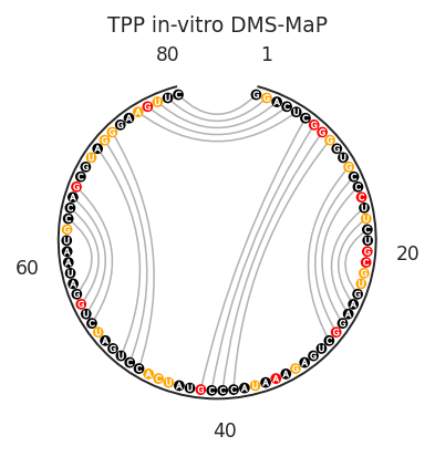
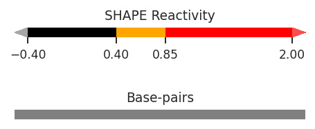
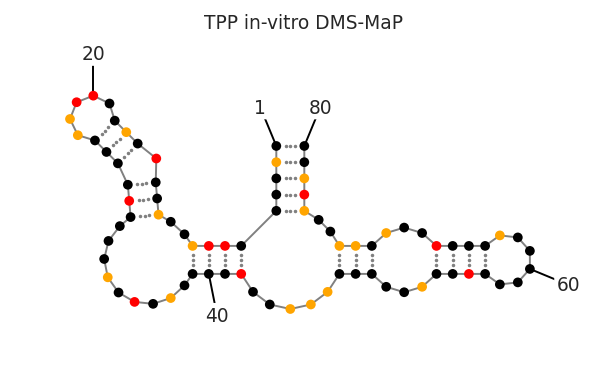
Secondary structure diagrams
Secondary structure diagrams display per-nucleotide and inter-nucleotide measurements and sequence annotations on a secondary structure diagram.
[8]:
plots = rnav.plot_ss(
    samples=[tpp],
    structure="ss",
    profile="dmsmap",
    colors={"nucleotides": "profile"},
    nt_ticks=20
    )
Interactive 3D molecule renderings
These renderings display per-nucleotide and inter-nucleotide data on 3D RNA molecular structures.
[9]:
plot = rnav.plot_mol(
    samples=[tpp],
    structure="pdb",
    colors="sequence",
    rotation={'x': -110, 'z': -30, 'y':-10},
    )
3Dmol.js failed to load for some reason. Please check your browser console for error messages.
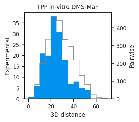
Distance distribution histograms
Distance distribution histograms display the 3D distance distribution of sets of inter-nucleotide measurements.
[10]:
plot = rnav.plot_disthist(
    samples=[tpp],
    structure="pdb",
    interactions="ringmap"
    )
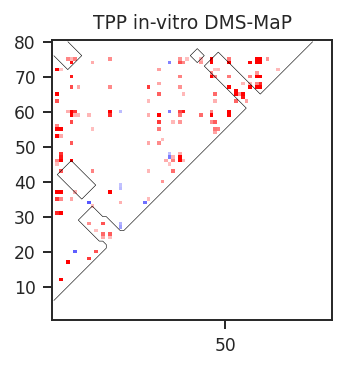
Heatmaps and contour maps
Heatmaps and contour maps are useful for displaying dense inter-nucleotide measurements or inter-nucleotide data density while highlighting defined regions such as helices or 3D interactions.
[11]:
plot = rnav.plot_heatmap(
    samples=[tpp],
    sequence="ss",
    structure="ss",
    interactions="ringmap",
    )
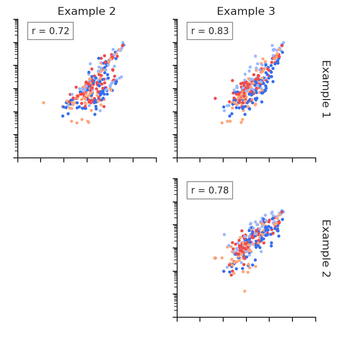
Linear regression plots
Linear regression plots quickly compare multiple sets of per-nucleotide data and display slope, R^2, and density.
[12]:
plot = rnav.plot_linreg(
    samples=[rnasep_1, rnasep_2, rnasep_3],
    profile="shapemap",
    scale="log",
    )
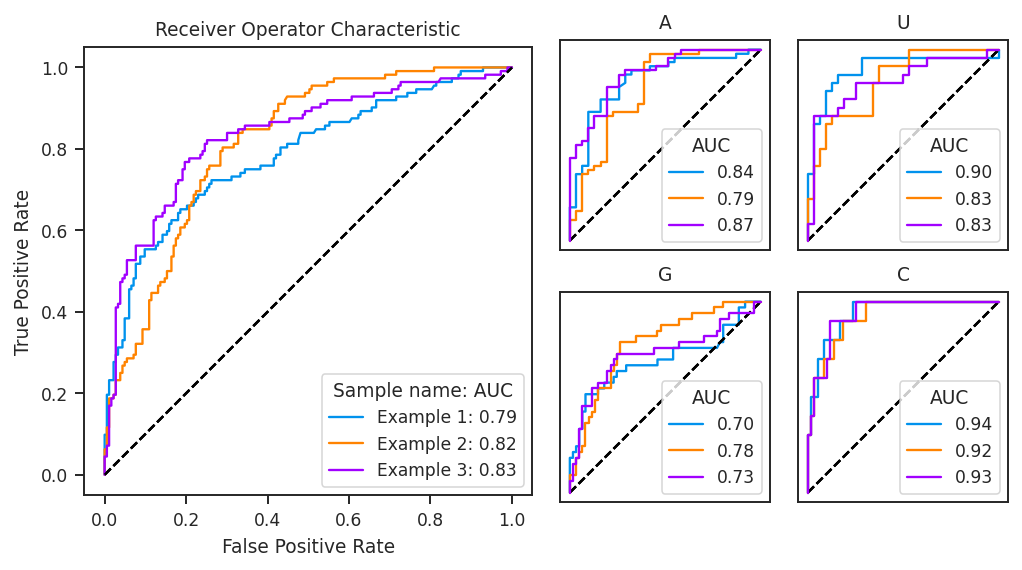
Receiver operator characteristic curves
ROC curves are a way to determine how well per-nucleotide data predict a classifier, such as base-paired vs. unpaired status.
[13]:
plot = rnav.plot_roc(
    samples=[rnasep_1, rnasep_2, rnasep_3],
    profile="shapemap",
    structure="ss_ct",
    )
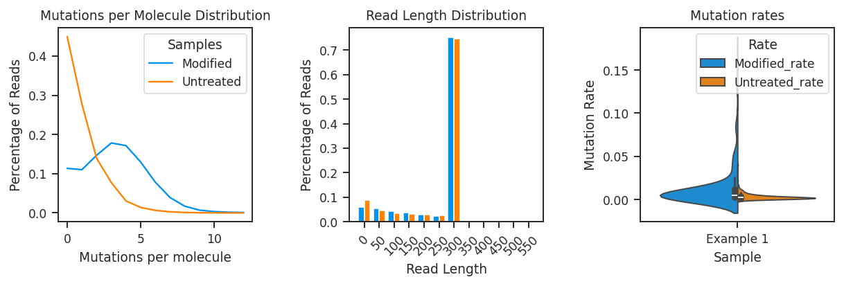
ShapeMapper2 quality control plots
ShapeMapper2 QC plots display useful quality control metrics from ShapeMapper2 analyses.
[14]:
plot = rnav.plot_qc(
    samples=[rnasep_1],
    profile="shapemap")
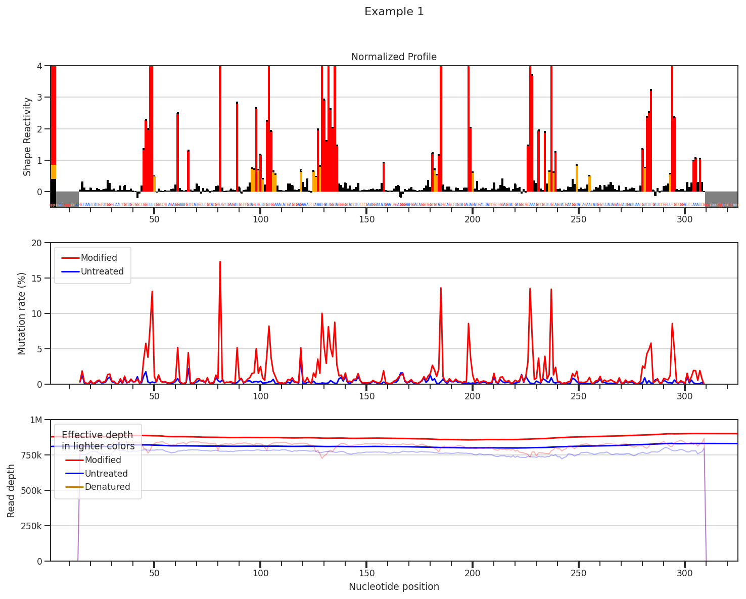
ShapeMapper2 profiles
ShapeMapper2 profiles display normalized SHAPE profiles, mutation rates, and/or read depths in ShapeMapper2’s default layout.
[15]:
plot = rnav.plot_shapemapper(
    sample=rnasep_1,
    profile="shapemap",
    )