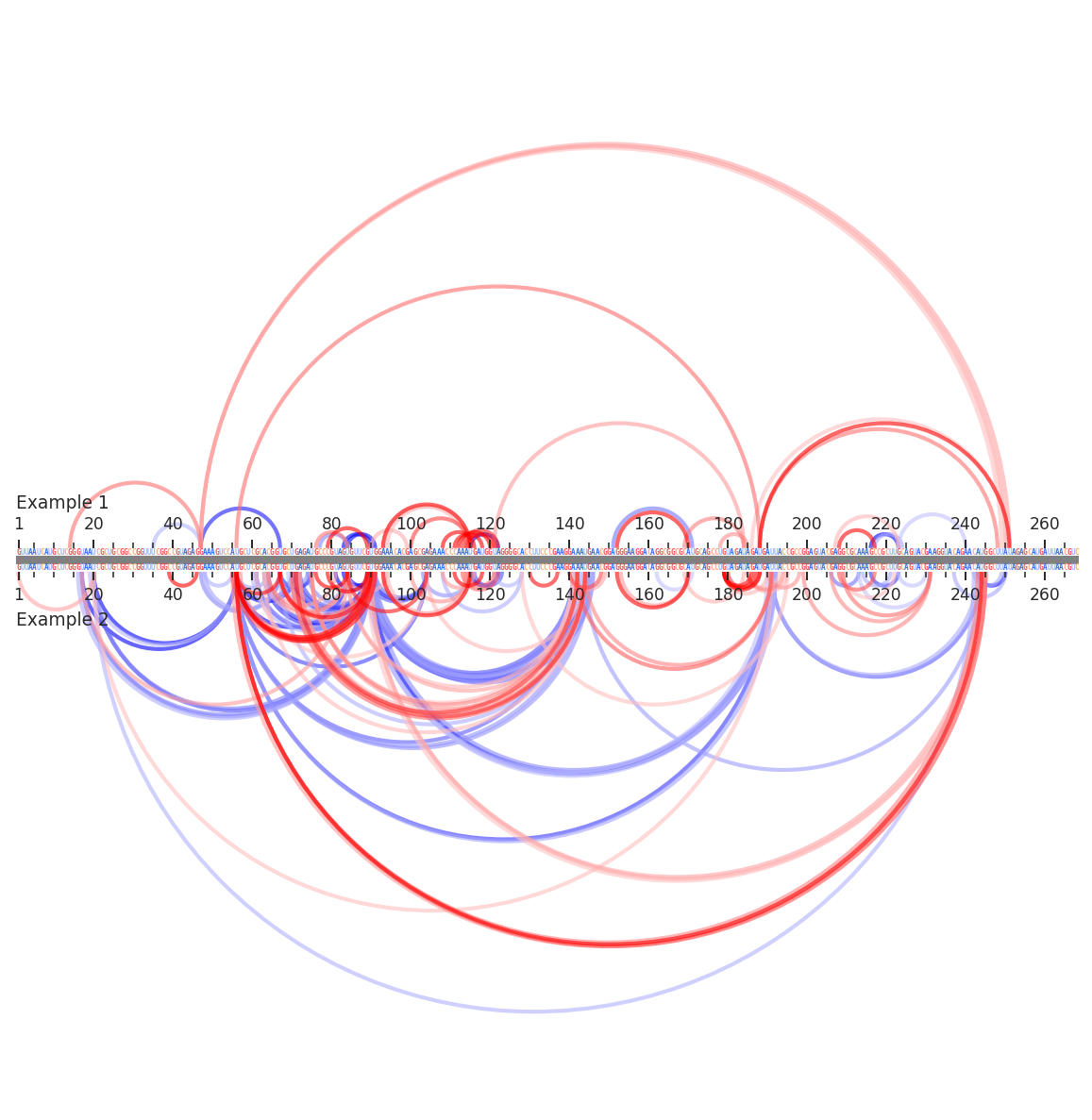
Arc compare plots
Arc compare plots are a flexible plot type for comparing multiple layers of RNA data between two samples. Sequence annotations, per-nucleotide data, inter-nucleotide data, and secondary structures can all be displayed.
[1]:
import rnavigate as rnav
from rnavigate.examples import rnasep_1, rnasep_2

plot = rnav.plot_arcs_compare(
    samples=[rnasep_1, rnasep_2],  # two example RNAvigate samples (SHAPE-treated RNaseP)
    sequence="ss_pdb",             # all data are sequence aligned to "ss_pdb" (for each sample)
    interactions="ringmap",        # plot interactions
)
[2]:
help(rnav.plot_arcs_compare)
Help on function plot_arcs_compare in module rnavigate.plotting_functions:

plot_arcs_compare(samples, sequence, structure=None, structure2=None, interactions=None, interactions2=None, profile=None, labels=None, profile_scale_factor=1, plot_error=False, region='all', colorbars=True, plot_kwargs=None)
    Generates a single arc plot displaying combinations of secondary
    structures, per-nucleotide data, inter-nucleotide data, and sequence
    annotations. The first sample will be on top, the second on the bottom.
    Center shows how these sequences are being aligned. This view does not

    Parameters
    ----------
    samples : list of 2 rnavigate Samples
        samples used to retrieve data
        This plotting function can only compare two samples at a time
    sequence : data keyword string, data object, or sequence string
        All data are mapped to this sequence taken from their respective
        sample before plotting
    structure : data keyword string or data object, defaults to None
        secondary structure to plot as arcs
    structure2 : data keyword string or data object, defaults to None
        another secondary structure to compare with the first structure
        arcs will be colored depending on which structure they are in
    interactions : one of the formats below, defaults to None
        format 1 (data or data keyword)
            Interactions to plot as arcs, no filtering performed
        format 2 (dictionary)
            e.g. {"interactions": format 1}
            additional filtering options can be added to the dictionary
        format 3 (list of format 2 dictionaries)
            This format allows multiple filtering schemes to be applied,
            each will be plotted on a seperate axis
    interactions2 : one of the formats below, defaults to None
        format 1 (data or data keyword)
            Interactions to plot as arcs, no filtering performed
        format 2 (dictionary)
            e.g. {"interactions": format 1}
            additional filtering options can be added to the dictionary
    profile : data keyword string or data object, defaults to None
        Profile from which values will be plotted
    labels : list of strings, defaults to sample.sample for each sample
        list containing Labels to be used in plot legends
    profile_scale_factor : number, defaults to 1
        small profile values will be hard to see
        large profile values will overwhelm the plot
        e.g. use 1/10 to scale values down 10-fold, use 10 to scale up
    plot_error : bool, defaults to ``False``
        Whether to plot error bars, values are determined by profile.metric
    region : list of 2 integers, defaults to [1, length of sequence]
        start and end positions to plot. 1-indexed, inclusive.
    colorbars : bool, defaults to ``True``
        Whether to plot color scales for all plot elements
    plot_kwargs : dict, defaults to {}
        Keyword-arguments passed to matplotlib.pyplot.subplots

    Returns
    -------
    rnavigate.plots.AP plot
        object containing matplotlib figure and axes with additional plotting
        and file saving methods