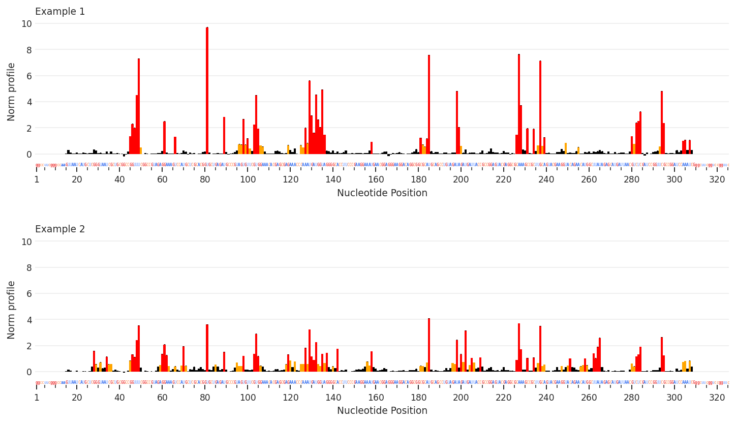
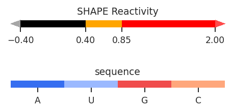
Profile plots
Profile plots are a useful way to compare multiple sets of per-nucleotide data, similar to skyline plots. Unlike skyline plots, values are displayed using a color-coded bar graph, like ShapeMapper plots, with sequences and sequence annotations along the x-axis. Unlike ShapeMapper plots, this are more flexible, and color-coding can be defined in the data class.
[1]:
import rnavigate as rnav
from rnavigate.examples import rnasep_1, rnasep_2

plot = rnav.plot_profile(
    samples=[rnasep_1, rnasep_2],
    profile="shapemap",
)
[2]:
help(rnav.plot_profile)
Help on function plot_profile in module rnavigate.plotting_functions:

plot_profile(samples, profile, sequence=None, annotations=None, domains=None, labels=None, nt_ticks=(20, 5), column=None, plot_error=True, annotations_mode='track', seqbar=True, region='all', colorbars=True, plot_kwargs=None)
    Aligns reactivity profiles by sequence and plots them on seperate axes.

    Parameters
    ----------
    samples : list of rnavigate Samples
        samples used to retrieve data
    profile : data keyword string or data object
        Profile from which values will be plotted
    sequence : data keyword str, data obj, or sequence str, defaults to `profile`
        All data are mapped to this sequence before plotting
        If a data keyword, data from the first sample will be used
    annotations : list of data keyword strings or data objects, defaults to []
        Annotations used to highlight regions or sites of interest
    domains : data keyword string or data object, defaults to None
        domains to label along x-axis
    labels : list of strings, defaults to sample.sample for each sample
        list containing Labels to be used in plot legends
    nt_ticks : tuple of two integers, defaults to (20, 5)
        first integer is the gap between major tick marks
        second integer is the gap between minor tick marks
    column : string, defaults to profile.metric
        column name of values from profile to plot
    plot_error : bool, defaults to True
        Whether to plot error bars, values are determined by profile.metric
    annotations_mode : "track" or "bars", defaults to "track"
        "track" will highlight annotations along the x-axis
        "bars" will use a vertical transparent bar over the plot
    seqbar : bool, defaults to ``True``
        whether to display the sequence along the x-axis
    region : list of 2 integers, defaults to [1, length of sequence]
        start and end positions to plot. 1-indexed, inclusive.
    colorbars : bool, defaults to True
        Whether to plot color scales for per-nucleotide data
    plot_kwargs : dictionary, defaults to {}
        Keyword-arguments passed to matplotlib.pyplot.subplots

    Returns
    -------
    rnavigate.plots.Profile
        the Profile plot object